
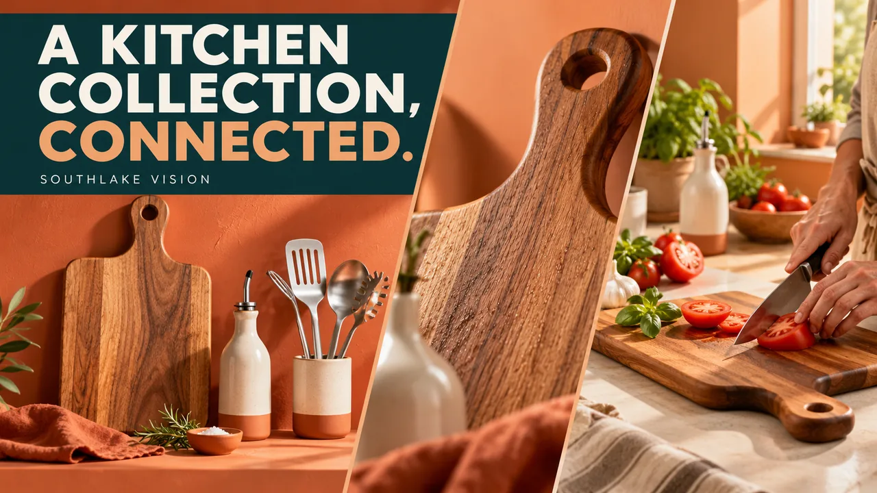
Original editorial cover illustration — Southlake Vision. Product imagery is illustrative.
Follow the same collection through three decisions
Shopify kitchenware photography in China becomes more purposeful when one collection is followed through three shopping contexts. First, a visitor discovers an item in a collection grid. Next, the visitor evaluates it on a product page. Finally, editorial merchandising shows how it belongs with other products in a kitchen or a campaign. These contexts need a related visual language but different amounts of information.
Use a hypothetical collection containing a wooden cutting board, a ceramic oil bottle and brushed steel utensils. The examples below describe a planning exercise rather than a completed client assignment. Give each item a stable product identifier and approved finish reference. Then create a placement map showing which photograph must work alone and which will be seen beside the rest of the collection.
Context one: make the collection grid easy to scan
A collection card is a recognition task. The product needs enough visual presence that a visitor can distinguish it from neighbouring items without opening every page. Choose an intentional camera angle and repeatable background treatment, then test the shortest and tallest objects together. Equal export dimensions do not automatically create equal visual weight when the underlying product shapes are very different.
Build a simple grid preview containing the actual product names and image frames used by your theme. A board may need a more overhead view while the bottle needs a visible profile. Keep the family resemblance through shadow, palette and spacing instead of forcing identical angles. Review kitchenware portfolio examples for composition ideas, then judge the selected treatment inside your own storefront. Include adjacent products from other categories in the test, since shoppers may encounter the collection through a mixed featured-products section. Check whether the bottle remains recognisable when a promotional label or product title appears nearby, and agree whether those interface elements need a different crop rather than a different photographic style.
Context two: give the product page inspection depth
Once a shopper opens the product page, repeat recognition is no longer enough. Organise photographs around inspection: overall shape, edge or handle, contact surface, included pieces and a credible use relationship. The wooden board might need a view of its thickness, while the bottle needs the closure and pouring area. Do not assign the same detail list to every product merely to make galleries uniform.
Plan detail photographs that remain understandable without lengthy explanatory text. An extreme crop can be attractive yet difficult to locate on the object. Pair it with a broader view when necessary. Our six-panel cutting board design project provides an information-design reference; use it to discuss how details relate, while developing fresh photography around the specifications and construction of your own collection.
Context three: let editorial scenes connect the range
Editorial merchandising can present the products as a coordinated kitchen story. Decide whether the scene is about food preparation, serving or countertop organisation. Assign a visible role to each item and choose one lead product. A composition in which every object competes equally can feel busy and fail to provide a useful campaign focal point.
Keep the relationship with the individual product pages honest. If a board, bottle and utensils are sold separately, do not write or design the scene as if it proves a bundled offer. Styling ingredients and textiles should support the mood without hiding the actual finishes. Our lifestyle photography service can be briefed around these connected scenes, with product-only references retaining the precise information an editorial arrangement may conceal.
Preserve colour relationships across all three contexts
The same ceramic bottle should not become a different shade as it moves from a collection tile to a warm kitchen scene. Establish an approved neutral reference and compare the editorial treatment against it. Keep natural atmosphere, but watch for coloured props or surfaces reflecting into pale ceramics and steel. A fashionable palette is useful only when the collection remains recognisable.
Photograph representative products together during the visual test. This reveals whether the wood, glaze and metal belong in one colour system without making their materials look identical. Agree which stylistic decisions can vary by placement and which must remain stable. The result should be a connected family with appropriate context, rather than a single colour grade applied indiscriminately to every photograph.
Design crops around actual storefront behaviour
Before final capture, inspect how your Shopify theme presents collection cards, product galleries and editorial blocks. Themes can frame, crop and reposition images differently. Record the behaviour you actually observe on the intended layouts, including mobile presentation, instead of assuming one platform-wide image shape will work everywhere. Prepare test placeholders if the storefront is still being developed.
Capture alternative compositions where a crop cannot preserve the information. A wide editorial scene with a bottle at the far edge may not survive a narrow mobile frame. A detail designed for a product gallery may be too abstract for a collection tile. Coordinate product photography with the intended placements so crop flexibility comes from composition choices rather than repeated emergency extension and retouching after delivery.
Review connected journeys instead of isolated favourites
Create three previews using the current proofs: a collection grid, one complete product gallery and an editorial section linking to the collection. Follow the products through that journey. Does the editorial bottle match the item on its product page? Is the material detail consistent with the tile? Can a shopper identify the lead product without guessing which accessory is for sale?
Review each preview on the actual theme at useful desktop and mobile widths when available. Check thumbnail visibility, crop loss and visual hierarchy separately from full-resolution image quality. Consolidate feedback by placement and asset identifier. This gives the studio precise corrections without asking it to replace a useful product-page detail merely because that detail was tested in a collection card where it was never intended to appear.
Hand over a collection system that can expand
Deliver the approved masters with a placement map and SKU list. Distinguish collection-card exports, inspection photographs and editorial crops. Keep the link to source masters visible so later changes can be assessed accurately. A new handle finish may affect a small part of the library, while a changed overall shape can require a broader update.
The Southlake Vision homepage introduces photography and creative services that can share this collection brief. Send your Shopify kitchenware plan with product photographs, collection structure, storefront examples and the three shopping contexts you need to cover. We can discuss which compositions should be shared, which need separate capture and which theme previews will provide meaningful approval evidence before the final delivery is prepared.
Frequently asked questions
Should every collection card use the same camera angle?
No. Different shapes may need different viewpoints to remain identifiable. Establish consistency through related background, shadow, spacing and product prominence, then test the actual mixed grid. A forced angle can make the collection less useful even when it appears technically uniform.
Can editorial images replace product inspection views?
They provide a different service. Editorial images connect products with a setting and a brand story, while inspection views show construction and individual details. Use both where justified and avoid making a styled group the only clear evidence of what each product includes.
What storefront information should I send before shooting?
Send the intended theme layouts, representative collection and product pages, mobile screenshots and planned editorial placements. Identify any automatic cropping or image-position settings already chosen. The studio can then evaluate compositions against your actual storefront rather than an assumed generic Shopify template.