
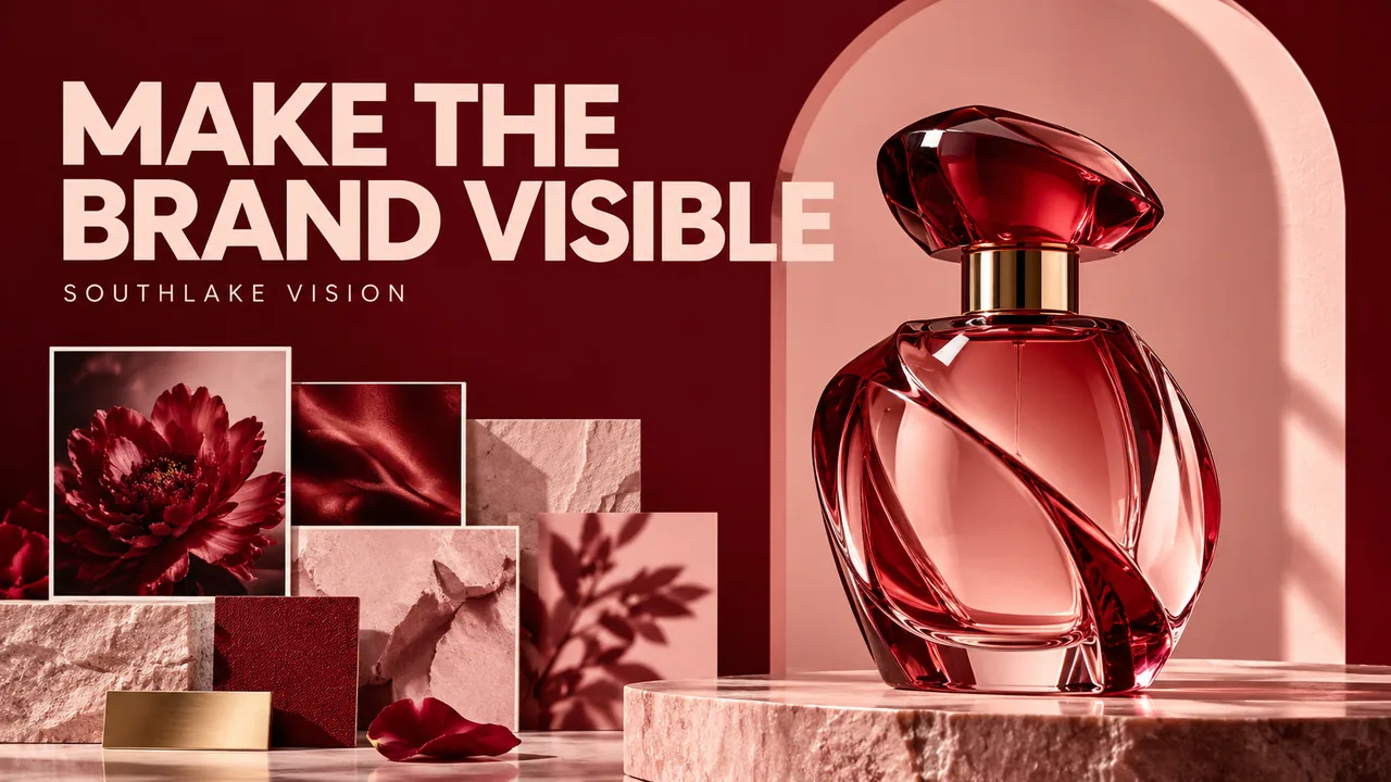
Original editorial cover illustration — Southlake Vision. Product imagery is illustrative.
Translate brand language into visible decisions
Commercial product photography should communicate a brand position through choices a production team can execute. Words such as premium, playful or natural are useful starting points, but they are not complete instructions. Ask what those words mean in the image: controlled reflections, unusual colour combinations, soft textures, generous negative space or a direct camera angle. Different brands can use the same adjective while expecting very different pictures.
Create a short visual statement that connects audience, product benefit and mood. A hypothetical refillable fragrance brand might want a calm, tactile image that emphasises the bottle's material and everyday ritual. From that statement, choose visible rules. This gives the studio a basis for proposing lighting and styling, and gives reviewers something more precise than whether an image simply feels expensive.
Choose a single communication priority
A campaign frame cannot give equal attention to every benefit. Decide what the viewer should notice first, what should become clear next and what can be supported elsewhere. The priority might be a sculptural shape, a distinctive texture or a specific use moment. If an image is also expected to display every accessory and several claims, the concept may need to become a sequence rather than one crowded composition.
Write the intended first impression beside each proposed hero frame. Then remove elements that compete with it. This does not require minimal styling in every case; a layered scene can still have a clear hierarchy. The practical test is whether the subject remains recognisable at the size where the advertisement or banner will appear, rather than only when the full image is opened on a large monitor.
Build a reference board with reasons and exclusions
A useful reference board explains the purpose of each image. Mark the desired quality of light, colour relationship, prop density or viewpoint. Include an exclusion list where misinterpretation is likely: avoid clinical lighting, avoid rustic wood, or keep water effects away from the label. These notes tell the production team how to combine influences without reproducing another brand's arrangement.
Include references from relevant commercial and lifestyle photography as well as examples from your own channels. Ask which visual elements genuinely belong to your product story. Fashionable imagery can attract attention while making a practical household item feel unfamiliar or difficult to use. Keep the concept distinctive, but make sure the selected style supports what the product actually does and the market position you want to build.
Make material treatment part of the creative direction
Lighting affects perceived material as much as mood. A broad reflection can make glass feel soft and sculptural; a more defined highlight can communicate polish and precision. Textiles need enough tonal variation to reveal weave and fold. Matte surfaces may require careful separation from a similarly coloured background. Explain the product qualities that must remain visible, even if the overall treatment is dramatic.
Review a material test before approving a complex composition. Confirm whether the surface still looks like the sample and whether labels remain readable. A creative shadow should not hide the feature the campaign is meant to introduce. The studio can adjust contrast, diffusion or camera position, but the brand must identify which characteristics are nonnegotiable. An ambitious mood works best when it is built around those constraints.
Style a scene that supports the story
Props create context, associations and scale. Choose them because they support the concept rather than because they happen to match the background. A warm bath ritual may justify fabric, water and skin contact, while a precision tool may need an entirely different visual vocabulary. List the role of every major prop and remove anything that creates an unintended category or usage implication.
Check practical relationships within the scene. Objects should sit convincingly, surfaces should support the product's weight, and human interactions should be physically credible. Indicate which items are included in the sale. If casting is required, consult model selection with the action and audience in mind. A beautiful person holding a product arbitrarily adds less useful information than a natural, well framed interaction that demonstrates its purpose.
Design around the final placement and text
The same campaign may need a wide website banner, a vertical advertisement and a compact collection image. These are different compositions, even when they share a set. Show the studio real layouts or wireframes and mark the space reserved for headlines, logos or interface elements. A crop should be planned while the camera is on set, not discovered as a problem after retouching.
Identify which frames need clean versions without text and which are finished designed assets. Agree orientation variants, final export sizes and whether layered files are included. A larger source image can support several crops only if the subject and background were framed for them. Discuss adaptations with the photography and design team before estimating deliverables so a request for one hero does not quietly become an undefined collection of layout versions.
If the campaign also introduces a new box or label, align the printed presentation with the photographed sample. A coordinated packaging design brief helps the production team identify which artwork version belongs in the final visuals.
Approve concept, execution and factual accuracy separately
A staged review can protect a strong idea while catching practical errors. Approve the concept and its visual rules first, then review a test for lighting, material and composition. Finally inspect the selected files for product accuracy and retouching. Combining all three decisions at the end makes every correction feel like a disagreement about the entire creative direction.
Keep feedback connected to the brief. If a reviewer asks for a brighter image, clarify whether the issue is product visibility, brand mood or the specific placement. Those problems may require different solutions. When the direction changes, document what is replacing the earlier decision and assess whether new props, capture or layouts are needed. Creative flexibility is valuable, but it works best with explicit boundaries and a clear approval owner.
Carry the visual system beyond one campaign
Once the hero images are approved, record the decisions that could guide future production. Keep the colour relationships, lighting logic, material treatment and composition principles alongside the final files. Distinguish the stable brand rules from seasonal choices. This helps a later product launch feel related without repeating exactly the same scene or turning every photograph into an imitation of the first campaign.
Southlake Vision combines photography with video, listing design and other creative production. Bring a concise brand brief, intended placements and approved product facts when discussing a project through the production process. A strong commercial image should be memorable, but it should also remain deployable and accurate. The practical goal is a recognisable visual language that your marketing team can use confidently, not an isolated impressive picture with no clear role.
Frequently asked questions
Can a creative photograph also be a catalogue image?
Sometimes, but its composition must still provide the necessary product information. A campaign hero often benefits from mood and selective emphasis, while catalogue images need more neutral coverage. Plan complementary assets rather than forcing every purpose into one frame.
What should a brand brief say about colour?
Identify core colours, acceptable accent colours and combinations to avoid. Include physical product references where colour accuracy matters. Explain which colours belong to the brand environment and which must match the sample closely.
How do we keep a concept original?
Explain the underlying qualities you admire in references rather than requesting a duplicate scene. Build the composition around your own product, audience and communication priority. Approve a distinctive combination of lighting, setting and framing through the concept stage.