
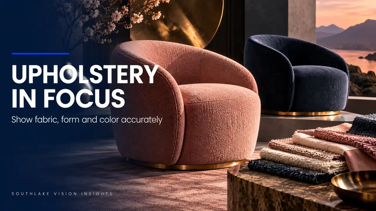
AI-generated editorial illustration. Not a Southlake Vision client project.
Keep the frame stable while the fabric changes
Two upholstery variants can look like different furniture designs when they are photographed from slightly different heights or styled with different cushion pressure. That inconsistency makes comparison harder for buyers. A furniture brand should preserve the visual geometry of the design while allowing each fabric’s genuine texture and colour to remain visible.
This requires more than replacing a colour in editing. Southlake Vision can plan an upholstery series around repeatable camera placement, physical styling references and material-specific detail views. The central decision is which aspects should stay fixed and which differences need to remain visible because they belong to the product being sold.
Establish the real reference shape
Choose the approved assembly and record its overall dimensions, feet, arm profile and cushion arrangement. Check that the frame is fully assembled before setting camera position. Uneven floor contact or a loosely fitted back cushion can alter the silhouette as much as the photography itself.
Capture a reference from the principal viewing angle and note the position of seams and cushion edges. Do not reshape every version until it resembles an idealised render. The reference should represent the actual design under ordinary presentation conditions. If one sample has a construction discrepancy, send it to the brand for a decision instead of hiding it through camera placement.
Lock the perspective with physical measurements
Mark tripod position, camera height, subject location and orientation. Save the lens and camera settings, but remember that focal length alone does not define perspective; camera distance matters. Use a fixed reference on the floor or background so a later upholstery variant can occupy the same position.
Compare the frame edges and visible side depth against the approved view before shooting every variant. A subtle rotation can make one chair look deeper or one sofa appear wider. Our product photography service can include these setup records as part of a repeatable catalogue assignment, particularly when replacement covers or later colours will arrive after the main collection.
Style cushions without changing the product
Agree a repeatable method for settling cushions, arranging loose covers and smoothing temporary transport creases. Record which areas are intentionally relaxed and which seams should align. Upholstery is flexible, so a completely rigid pixel match may be inappropriate even when the camera is fixed.
Use measured visual references rather than adding hidden volume to make one version appear fuller. If the product needs recovery time after packing, confirm a suitable preparation approach with the owner before the shoot. Avoid aggressive treatments that could affect the material. Photograph styling adjustments when they influence the silhouette so the next variant can be prepared with the same intention.
Light texture without shifting perceived colour
A directional light may reveal a weave beautifully while creating deep shadows across a light fabric. A very broad flat source can make velvet or bouclé look smoother than it is. Test the material under the main catalogue setup, then decide whether it needs a separate texture detail.
Keep exposure and colour management consistent across the comparison views, using an agreed reference capture. Some fabrics change appearance with pile direction and viewing angle; show that property honestly rather than selecting only the most saturated face. In furniture cases, use the examples to discuss treatment and perspective, then assess each real upholstery material before finalising your own image standard.
Show variants in a way buyers can compare
A colour selector works best when the chosen image changes the upholstery while retaining a comparable framing and scale. Keep room props consistent where they appear in variant views, because a warm throw or bright cushion can affect the perceived colour of nearby fabric.
Use separate editorial images when a different mood or styling story is needed. A warm evening room may be excellent campaign content but a poor basis for comparing grey and beige upholstery. Give the ecommerce team a clear distinction between neutral comparison assets and styled scenes, with filenames that preserve the correct fabric code instead of relying on informal colour names.
Treat digital recolouring as a limited production choice
Digital recolouring may be considered for particular assignments, but it cannot automatically reproduce another fabric’s weave, pile, stitching or seam behaviour. Ask whether the variants are the same textile construction or genuinely different materials. Photograph the actual material references needed for an informed decision.
If recolouring is agreed, document which images were adapted and require review against the approved product evidence. Do not use it to conceal a construction change. For a hypothetical chair offered in linen and velvet, changing the hue of one photographed surface would not establish the other material’s texture. Separate photography may be the clearer option for the buyer.
Deliver a variant matrix rather than loose colour folders
Create a matrix with furniture model, upholstery code, angle, crop and asset status. Review equivalent images side by side before delivery. Check that dimensions, feet and accessories have not changed across variants, and make any intentional difference visible in the product information.
Preserve a clean master and the setup reference for future additions. Ask the publishing team to test the images inside the actual variant selector, where inconsistent framing becomes immediately apparent. Contact Southlake Vision with the furniture dimensions, textile samples and planned colour range to build a series that supports direct comparison while retaining the character of each upholstery choice.
Frequently asked questions
Should all fabrics use exactly the same lighting?
Use a consistent base treatment for comparison images, then add material-specific details where necessary. One lighting arrangement may not communicate every texture equally well. The goal is compatible colour and geometry while retaining genuine material differences, rather than forcing velvet, linen and bouclé into an identical appearance.
How can we add another upholstery colour months later?
Retain the approved reference sample where possible and save physical setup measurements, styling photographs and colour reference captures. Rebuild the setup, then review a comparison image before completing the new batch. Also confirm that the furniture frame and feet remain the same production version.