
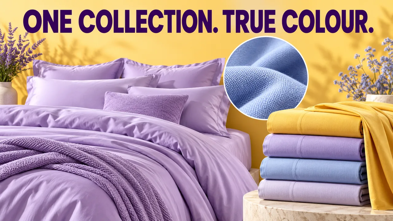
Original editorial cover illustration — Southlake Vision. Product imagery is illustrative.
Make colour identity a product record, not a mood
Bedding photography in China for Shopify needs a reliable way to identify colour before the room styling begins. Names such as ivory, oat or lavender can describe different shades across suppliers and production batches. Record the product code, colour code, fabric composition supplied by the brand and the physical sample version. Attach a neutral reference photograph that helps the team identify the correct piece.
Treat the lifestyle palette as a separate decision. A warm bedroom may suit the brand, but it should not become the only reference for the bedding’s actual shade. At Southlake Vision, the brief can connect room photography and detail production, while the approved fabric record remains the reference for variant identity across both. This distinction is essential when similar neutrals sit beside one another in a storefront. Viewer displays, surrounding page colours and room lighting can change perceived colour, so the workflow should improve consistency rather than promise identical appearance on every screen. Keep the physical sample as the reference when a disputed shade needs further review.
Check batch differences before promising visual consistency
Samples arriving on different dates may come from different fabric batches. Compare them physically before grouping them into one colour approval. Identify whether variation is an intended product characteristic, a provisional sample issue or a production difference requiring the brand’s decision. The studio should document what arrived rather than silently choose the piece that is easiest to match in postproduction.
For a hypothetical three-shade duvet collection, keep a small approved reference for each shade with its batch information. If a later sample appears warmer, record the difference and ask whether it represents the current saleable product. Do not retouch a new batch to imitate an old image without confirming that the result still describes what customers will receive. A consistent library must remain consistent with the merchandise itself.
Separate colour references from texture demonstrations
A neutral fabric view is useful for comparing shades, while a directional detail photograph can reveal weave, stitching and surface relief. Those purposes may require different lighting treatments. Ask for both where the buying decision depends on them. Increasing contrast in a colour reference can exaggerate texture and make one variant appear rougher than another even when the fabrics are the same.
The textile project showing yellow and cream towels provides a concrete fabric-styling reference: folded edges, layers and contrasting colours make the surfaces easy to inspect. Use it to discuss colour relationships and tactile detail, then review the broader textiles portfolio. Identify the qualities your bedding samples need to show, such as the difference between a smooth sateen surface and a more visibly structured weave.
Create a repeatable weave detail without changing the fabric
Choose a detail area that contains meaningful information: the weave, a stitched edge, a reverse surface or a closure. Record the viewpoint and approximate coverage so later variants can be compared fairly. A macro view of one shade and a distant fold of another do not provide equivalent evidence, even if both photographs are individually attractive.
Preserve the real surface. Preparation can remove temporary lint and arrange folds, but retouching should not erase the weave or create a heavier fabric appearance. Some materials catch directional light differently across a fold, so review flat and shaped areas together. The product photography service can be briefed with a dedicated texture comparison, making the required evidence explicit before the bed styling consumes the production schedule.
Treat size and colour as separate variant axes
A new colour does not necessarily change the product’s fit, while a new size may change the visible arrangement on the bed. Build a variant matrix that separates those axes. Identify which combinations require distinct room views and which details can be shared accurately. Avoid implying that one photographed fitted-sheet corner demonstrates the fit of every size in the collection.
Check the approved product dimensions against the actual bed and inserts used for the relevant scene. Mark styling components that are not included in the sale. If a size requires another arrangement, record it as a deliberate exception rather than stretching the image or digitally changing the proportions. This keeps the visual family coherent without disguising meaningful differences between products that shoppers are selecting from the same storefront.
Preview shade selection inside the actual Shopify theme
Review the planned product and collection pages in the actual theme where possible. Check how selected variants change the visible gallery, whether thumbnails preserve subtle shade differences and whether mobile crops remove useful fabric detail. Do not assume a photograph approved in isolation will remain informative once it appears beside a small colour selector or inside an automatically cropped card.
Use real product names and representative variant combinations in the preview. A customer choosing between cream and pale yellow needs a truthful visual distinction, not two different room treatments that exaggerate or conceal the difference. If shade swatches are part of the storefront, agree how they are sourced and approved. Keep the photography record separate from a developer’s display choices, while reviewing both together before publication.
Approve colourways as a group and record exceptions
Review a contact sheet of all colour references under consistent viewing conditions, then compare the room views and details against it. Check whether one shade has drifted warmer, whether a textured view implies a different material and whether the selected crop hides a pattern repeat. Reviewing one colour per day on different devices makes collection-level differences harder to recognise.
Document approved variations rather than forcing everything to look identical. A fabric with genuine surface variation should retain that character, while accidental colour shifts should be corrected. Use the production process to name the person who approves fabric appearance and the person who approves styling. Keep consolidated comments tied to variant codes so a correction to ivory does not unintentionally change the appearance of cream throughout the delivery.
Maintain the collection as shades and batches evolve
The final library should connect each approved master to the product, colour, size and sample version it represents. Separate reusable detail photographs from variant-specific room scenes. Retain a concise setup reference and a list of agreed exceptions so the next batch can be evaluated against known decisions. A new fabric or construction should trigger a fresh assessment rather than automatic reuse of every old view.
Send your bedding collection brief with the variant matrix, fabric references, sample dimensions and intended Shopify placements. Include existing photographs you want to match and identify any batch differences already known. We can discuss neutral shade references, weave coverage and the room views actually needed, giving the collection a controlled visual foundation while keeping its real materials and variant distinctions visible.
Frequently asked questions
Can every bedding colour be generated from one photograph?
A colour adjustment may be suitable for some agreed work, but it cannot automatically reproduce differences in sheen, weave or light response. Compare the actual samples and approve the method before proceeding. New materials or noticeably different finishes may need their own capture.
Is the linked textiles project a bedding shoot?
No. It shows yellow and cream towels in styled textile imagery. It is useful as a reference for fabric presentation and colour relationships, but it should not be described as a completed bedding project or used to imply unverified bedding outcomes.
What should happen when a later fabric batch changes shade?
Identify the batch and compare it with the approved reference. The brand should decide whether it represents the current product and whether existing imagery remains accurate. Record that decision and update affected assets rather than automatically recolouring the new batch to match an outdated photograph.