
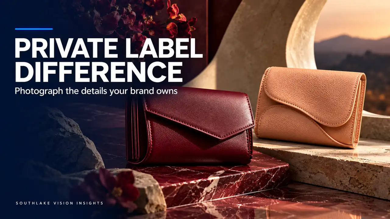
AI-generated editorial illustration. Not a Southlake Vision client project.
Begin with ownership of a difference
Amazon private label product photography works best when the brand can explain what it has actually chosen, changed or controlled. A logo by itself may identify the seller, but it does not explain the product. Before arranging a premium set, identify differences in construction, material, fit, supplied components or intended use that deserve visual attention.
Ask the product owner to separate these from ordinary category features. A feature shared by many competitors can still matter to customers, but it should not be presented as an exclusive invention. The production team at Southlake Vision needs this distinction to decide which details require a dedicated photograph and which belong in the basic product explanation.
Create a difference ledger with visible evidence
For every proposed point of difference, record the product fact, the evidence available and the view that could reveal it. “Cleaner stitching” is subjective; a close view of the actual seam lets the shopper inspect the construction. “More convenient” needs a defined action, such as opening a compartment with one hand, before a photographer can demonstrate it responsibly.
Use approved samples rather than a supplier’s generic catalogue photograph as the evidence source. If the difference cannot be seen, explain what verified information would be needed to support it. This ledger prevents an attractive layout from turning a vague sales phrase into an apparently proven product claim.
Find the right viewpoint for the construction
A hypothetical wallet may have a changed coin pocket, a different edge finish or a deliberately slim card layout. Those decisions need different viewpoints. A front hero can establish shape, while a side view shows thickness and an open view explains compartment access. One dramatic angle rarely covers all three convincingly.
Review the wallet photography project to discuss how a small object can be described through scale, angle and detail. Then test your own sample with its intended contents. Overfilling or unrealistically flattening a wallet may create an appealing silhouette while misrepresenting how the product is used.
Distinguish material character from decorative grading
Lighting should make the actual finish understandable. A matte surface needs enough directional light to reveal texture without appearing oily. Smooth coated leather needs controlled reflections that describe the form rather than erase it. Ask the photographer what visual cues will remain after retouching, especially where surface variation is part of the product.
Agree a neutral reference before selecting a stylised colour treatment. A fashionable warm grade can change the perceived shade of brown or burgundy. Keep the identity views dependable, then decide where more expressive lighting supports the brand world. The shopper should still recognise the same item across the whole gallery.
Show the use case your design serves
A meaningful difference often becomes clear through use. If the design prioritises quick card access, show the action with ordinary hand positioning. If a kitchen tool improves storage, show its real stored footprint. Define a believable setting and the action being demonstrated before selecting props or casting a model.
Avoid loading the scene with signals of wealth that have little relationship to the product. A luxury watch beside an ordinary wallet may create atmosphere but can also distract from the construction you want inspected. The product photography service can be scoped around specific evidence shots and a smaller number of purposeful lifestyle images.
Write copy after reviewing the evidence
When photographs arrive, compare each proposed phrase with what the viewer can see and what the product documentation supports. If the image shows an internal divider, say what it separates. Do not jump from that visible feature to a broad promise of improved organisation for every customer. Specific language gives the image a clear role.
Maintain a short claim register with the approved wording, source of verification and image identifier. This is useful when a designer adapts copy into an Amazon graphic or another language. Without that record, a carefully limited statement can gradually become an unsupported superlative during routine revisions.
Make comparison fair and understandable
If you need a comparison, start with alternatives inside your own product family. Show actual differences in dimensions, compartment layout or included accessories with consistent views and units. A customer deciding between two models needs clear distinctions rather than a larger collection of adjectives. Keep optional accessories visually separate from included items.
For comparisons beyond your range, verify the evidence and applicable rules before commissioning artwork. Avoid anonymous inferior products staged to make yours look stronger. A well photographed explanation of your own design often communicates enough without implying that every competing product has a defect or an outdated construction.
Build a repeatable record for the next production run
Store the approved sample identity, lighting reference and difference ledger with the final files. When the factory changes material or construction, review which assets become outdated. A familiar filename does not guarantee the image still represents the current product. Small physical changes can matter more than a substantial graphic refresh.
Send those records and your proposed differences through the contact page when planning a shoot. Southlake Vision can help translate a product owner’s decisions into clear views and designed assets. The aim is a recognisable product story rooted in actual choices, giving the private label brand a stronger explanation than a logo applied to generic supplier imagery.
Frequently asked questions
What if our product is very similar to other private label items?
Focus on a reliable explanation of your actual version: materials, dimensions, included items, packaging and the use cases it suits. Do not invent a unique feature to justify photography. Consistent, accurate images can clarify the offer even when the physical category contains many similar products.
Should every point of difference become an infographic?
No. A close photograph, sequence of views or short demonstration may communicate the detail more clearly. Use a graphic when labels, measurements or comparison structure add needed information. If the design repeats what is already obvious, keep the image simpler and allocate the space to another buying question.
Related reading
Official resources
Platform resources checked on 18 October 2026. Confirm current category and account requirements before publishing your assets.